My WordPress origin story

WordPress logoWordPress.org profiles have this one question about your WordPress origin story. That question inspired me to write my WordPress story here.

My initial contact with WordPress was on the summer of 2005, close to 10 years ago. Before that, my personal site and blog was running on a custom built blogging engine I had created for myself.

Back then, WordPress was at version 1.5. Later that year 2.0 was released with a redesigned admin UI. That is when I actually started using WordPress.

Blogging era

From the beginning I created my own theme. I wanted to tinker with everything and was happy to find out WordPress did not prevent that. I created a lot of functionality on top of it, mostly for my personal use. Like a database of books I had read and was going to read.

While working on my day job as a .Net developer, I did some freelancing on the side to build a couple of small sites on WordPress. That made me learn WordPress even better.

WordPress was also used on some trivial projects on my day jobs. Install, customize lightly and forget. Latter one being a bad idea, now that I think of it.

My day job at the time was a lot about creating a custom CMS for a media company and later for a web development company. (At the time, that made some sense. Now it does not.)

.Net web development back then was Web Forms development. Web Forms is this crazy model that totally disregards how the web actually works. I kept creating ways around it. WordPress was totally different. For a web geek, it made sense as is.

WordPress gave me ideas. For six years, working with different CMSs and other projects, I took a lot ideas out of WordPress and used them with commercial projects.

Until I started H1 in 2010 and was finally able to work with the real thing.

H1 era

Back in 2010, just a couple of months before H1 was founded, WordPress 3.0 was released. 3.0 was actually something that made WordPress a lot more useful in terms of developing interesting websites. Mainly because of the addition of custom post types and taxonomies.

It was not my idea back then to create a company that would do WordPress development. I though I was going to do some .Net consulting. Which I did, but not for long. Before long, I was asked to build websites and to my taste, there was no good .Net CMS available. At least not one with a reasonable sticker price. Sticking to what I knew second best, I chose WordPress.

Soon, H1 was a three person company and somehow we had managed to hire the number one WordPress name in Finland, Daniel Koskinen. Just his presence made me more interested in WordPress and thus also made the company focus fully on WordPress. Now we have eight people and our commitment to WordPress is like no other company in Finland.

During these close to five years at H1 my relationship with WordPress has grown a lot.

I’ve created many sites on WordPress I am really proud of.

I’ve released my first plugin on the official repository, though most of the coding has been for clients.

I have submitted at least one patch to core WordPress. I have enhanced documentation of WordPress. I’ve translated Gravity Forms, one of the most popular plugins out there.

I’ve been to three WordCamps, one PressNomics and many local WordPress meetups.

I’ve spoken about WordPress. This year I will speak at WordCamp Finland and WordCamp Europe.

I have written about WordPress – here and on the company blog.

I will keep doing these things. I do this because I believe in WordPress.

I’m sure my WordPress story will not end any time soon.

Editor Buttons Simplified

WordPress admin interface is great and getting better all the time. One thing though I think has not received any thought in a long time is the selection of buttons on the TinyMCE editor interface.

Update 2015-05-18: The plugin is now available on the official WordPress.org repository with one major modification: there is only one row of buttons and an expand functionality. This works a lot better responsively than two separate rows do.

I have created a simple plugin (on GitHub as well) to be able to easily test the modifications I propose. But I wanted to explain the rationale behind all the changes here.

Here are the WordPress default buttons with the “kitchen sink” open:

That is a lot of buttons.

My initial proposal is this:

Let’s go through the changes now.

Headings are important

If you write a blog post longer than just a couple of paragraphs, you really need headings. The dropdown (called formatselect in TinyMCE) is hidden by default, behind the obscure kitchen sink button. Most users don’t know of its existence, so they end up making a paragraph bold to mark up a heading, which is not good for SEO and certainly is not properly marked up reusable content. Those, that do find the control, are forced to see two rows of mostly useless buttons all the time.

My solution is to put the dropdown as the first item on the default button row.

Heading levels

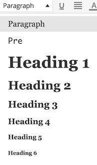
Here are the current dropdown values:

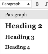
I do not think one should use h1 inside a post. That should be reserved for the post title only. Also, having all the six heading levels is too much. Three levels are enough for most uses. If you need more, you probably should divide the post into two or more separate articles to make it more readable.

Pre is useful if you paste code, but that is not for most people. Removed.

Here’s the simplified dropdown:

Alignment buttons

Alignment buttons can be used for two things. You can align text and you can align images. Alignment of text does not make much sense. Unless you write poetry maybe. Most users do not.

Alignment of images can be done by clicking an image in question and then clicking the proper alignment button from the popup menu.

Strikethrough and horizontal line

To simplify the default row a bit more, we could move the strikethrough and horizontal line buttons to the second row. Those buttons can be useful, but not most of the time.

Secondary row modifications

I would like to remove the underline button, since one should not write underlined text on the web in general. An underline denotes a link.

One should not use full justified text on the web, unless it can be automatically hyphenated. Until browsers do that, I would remove the button.

Text color choices should not be done by the author. Instead, a style selection tool could be used (that can be activated through the TinyMCE API, if needed for the content and the design of the site).

Indent and outdent buttons do not make sense to me. What is their use case? Remove them, I say.

Here is the end result for the secondary row:

It’s actually so small number of buttons that it almost makes sense to put all the buttons to the same row.

Conclusion

It is easy to revamp the editor toolbar to be move usable, simple and useful.

It will require a way more thorough analysis to make the changes on the product level, but at least for our clients a setup similar to what I have described above makes a lot more sense than the current default.

Carl Haglund ja WordPress

Helsingin sanomat kirjoittaa:

Puolustusministeri Carl Haglundin (r) henkilökohtaiselta verkkosivulta on löytynyt tietojen varastamiseen tarkoitettu haittaohjelma. Virus on naamioitunut yhteydenottoihin tarkoitetulle alasivulle ja ollut siellä tammikuun 23. päivästä alkaen.

Jutussa mainitaan, että ko. haittaohjelma iskee usein WordPress-alustan verkkopalveluihin. Sitä ei sanota, että Haglundin sivut on tehty WordPressillä. Tämä kuitenkin selviää Googlen cachesta ja samoin se, että WordPress-versio on ainakin viimeisen tiedon mukaan viimeisimmässä versiossa.

Erillisessä jutussa Haglund epäilee:

“Tämän päivän tapahtumien valossa näyttää, että se ei ole sattumaa. Tämä vaikuttaa järjestelmälliseltä”, Haglund sanoo.

Virustorjuntayritys F-Securen mukaan viruksen alkuperä viittaa Pietariin.

Haglund uskoo valikoituneensa iskujen kohteeksi, koska vastaa hallituksessa kyberturvallisuusasioista.

Oikein konfiguroiduille ja ylläpidetyille sivuille ei noin vain murtauduta. Todennäköisempää on, että yksi tai useampi seuraavista on totta:

  • Palvelimen käyttöjärjestelmä palvelinohjelmistoineen on jäänyt pahasti ajastaan jälkeen
  • WordPress tai jokin laajennus on jäänyt päivittämättä jossain vaiheessa
  • WordPressin (pää)käyttäjätunnuksen salasana on heikko tai on käytössä jossain muussa salasanat vuotaneessa verkkopalvelussa
  • Ensimmäisen murtautumisen jälkeinen siivoustyö on jäänyt puutteelliseksi

Jos mikään näistä ei ole totta, voidaan vasta sitten epäillä, että kyseessä on jokin muu kuin täysin tai puoliautomatisoitu hyökkäys, joka kohdistuu kerralla tuhansiin verkkopalveluihin. Tällaiset kun muodostavat aivan ylivoimaisen valtaosan kaikista hyökkäyksistä.

Tietysti antaa sekä paremman viestin omasta ammattitaidosta että hivelee enemmän omaa egoa, kun murtautumisen syyksi pannaan henkilön asemaan kohdistuva vihanpito eikä oma heikko tietoturvasta huolehtiminen.

Siivous on annettu teleoperaattorin tehtäväksi, mikä herättää ainakin minussa vähän epäluuloja. Oikeasti työ pitäisi antaa ammattilaisille, jotka tuntevat niin WordPressin kuin verkkosivujenkin tietoturvan. Muuten sivut ovat taas pian täynnä viruksia. Mutta mihinkään isoihin, Haglundin viittaamiin investointeihin ei tarvitse ryhtyä.

Jokaisen verkkosivuja ylläpitävän velvollisuus on huolehtia sivujensa tietoturvasta. Selitykseksi ei kelpaa se, että sivuilla ei ole suurta merkitystä tai että niillä ei ole salaiseksi luokiteltavaa tietoa. Murretut sivut kun aiheuttavat haittaa muillekin kuin verkkosivujen haltijalle.

Räätäli vs. puukottaja

Vierityspalkissa ajauduttiin jokin aika sitten keskustelemaan räätälöinnin semantiikasta. Tämä oli vain sivujuonne varsinaiseen keskusteluun siitä, onko WordPress ylipäätään räätälöitävä alusta. Jälkimmäiseen vastaan tarkemmin erillisessä kirjoituksessa, mutta ensin haluan määritellä mitä räätälöinti mielestäni on.

Räätälöinti on toiminnallisuutta laajentavaa tai muokkaavaa sovelluskehitystä eli ohjelmointia olemassa olevan, räätälöintiä tukevan järjestelmän päälle tiettyyn käyttötarkoitukseen, yleensä yhdelle asiakkaalle tai kapealle asiakassegmentille. Räätälöinti on siis sovelluskehityksen osa-alue. Joskus käytetään ilmaisua “täysin räätälöity”. Sillä tarkoitetaan tietojärjestelmää, joka on rakennettu matalamman tason sovelluskehyksen (framework) päälle. Aivan aidosti täysin räätälöityä koodia tuskin kukaan nykypäivänä enää tuottaa.

Mietitäänpä hetki sanan räätäli alkuperäistä merkitystä. Räätäli sekä tekee vaatteita kankaista (täysin räätälöity) että muokkaa ja korjaa valmiita vaatteita (räätälöity). Kun teknologia mahdollisti sarjatuotannon ja ulkoistaminen halpatyövoiman maihin laski kustannuksia entisestään, räätälin työt vähenivät radikaalisti. Räätäleitä tarvitaan yhä, mutta vain kaikkein rikkaimmilla on enää vara teettää vaatteensa omiin mittoihinsa räätälillä. Nykyisin räätälin tehtävät ovatkin pääasiassa pieniä muutoksia valmisvaatteisiin. Tietojärjestelmän räätälöinti ei ole täsmälleen sama asia, mutta analogia toimii monella tasolla.

Yleensä tietojärjestelmän räätälöinti tarkoittaa ohjelmointia. Sovelluksen asetusten muokkaaminen käyttöliittymän kautta voi olla sekin räätälöintiä, jos näin tavoiteltu kokonaisuus on monimutkainen ja siten vaatii syventyvää ajattelua ratkaisun löytämiseksi – eli kehittämistä (development).

Räätälöintiä voi tehdä hyvin tai huonosti. Huonoa räätälöintiä on esimerkiksi nojata järjestelmän dokumentoimattomiin rajapintoihin, olla hyödyntämättä dokumentoituja rajapintoja kehittämällä kokonaan oma, huonompi ratkaisunsa tai käyttää järjestelmän toiminnallisuutta sen käyttötarkoituksen vastaisesti.

Ehdotan, että tällaisissa tapauksissa ei puhuttaisi räätälöinnistä vaan “puukottamisesta”. Puukotus-termiä käytetään usein ikään kuin kunniamerkkinä, vaikka todellisuudessa puukottaja on erittäin vahva ehdokas Darwin-palkinnon saajaksi. Ihan vähän vain liioitellen: Tällaisen räätälöintitavan ehdottamisestakin pitäisi seurata välitön porttikielto ammattitehtäviin.

Räätälöinti vaatii siis aina syvällistä tietoa järjestelmän olemuksesta. Joitain järjestelmiä voi räätälöidä helpommin kuin toisia. Esimerkiksi WordPress on sekä blogialusta että räätälöitävä sisällönhallintajärjestelmä. Todella hyvä geneerinen sovelluskehitysalusta se ei kuitenkaan ole – ainakaan vielä – mutta joihinkin geneerisiin sovelluskehitystarkoituksiin se voi olla ihan kelvollinen valinta. Hyvä räätäli ei lähde tekemään jotain, joka on vastoin järjestelmän perusfilosofiaa, ellei ole varmaa, että tällaisen räätälöinnin riskit on huomioitu huolella.

Räätälöinti-sanalla on jostain syystä paha kaiku. Räätälöintiä vältellään välillä suorastaan hysteerisesti ja joidenkin järjestelmien (SharePoint) toimittajat jopa suosittelevat, ettei heidän tuotettaan räätälöitäisi lainkaan, mikä kuulostaa aika kummalliselle. Ehkä väärän maineen ovat luoneet puukottajat ja yritykset, jotka osaavat rahastaa myös osaamattomuudellaan?

Päätöksen räätälöinnistä pitää perustua tietoon ja se pitää tehdä järjestelmän ehdoilla. Räätälöinti ja sovelluskehitys yleisemminkin on hallittua riskinottoa. Esimerkiksi dokumentoitujakin rajapintoja käyttävä laajennus saattaa huomaamattaan nojata ei-dokumentoituun sivuvaikutukseen, joka taas voi päivitysten myötä alkaa toimia toisin. Mitä paremmin tällaiset riskit ymmärretään, sitä turvallisemmin räätälöinnin voi tehdä.

Räätälin ammatti on kunniakas käsityöläisammatti. Puukottaja on yhteiskunnan hylkiö, joka passitetaan vankilaan aina tavatessa. Pidetään nämä kaksi erossa toisistaan.