WordPress admin interface is great and getting better all the time. One thing though I think has not received any thought in a long time is the selection of buttons on the TinyMCE editor interface.
Update 2015-05-18: The plugin is now available on the official WordPress.org repository with one major modification: there is only one row of buttons and an expand functionality. This works a lot better responsively than two separate rows do.
I have created a simple plugin (on GitHub as well) to be able to easily test the modifications I propose. But I wanted to explain the rationale behind all the changes here.
Here are the WordPress default buttons with the “kitchen sink” open:
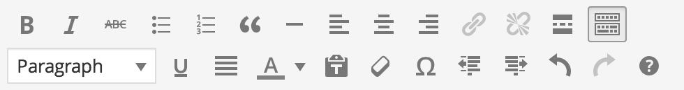
That is a lot of buttons.
My initial proposal is this:

Let’s go through the changes now.
Headings are important
If you write a blog post longer than just a couple of paragraphs, you really need headings. The dropdown (called formatselect in TinyMCE) is hidden by default, behind the obscure kitchen sink button. Most users don’t know of its existence, so they end up making a paragraph bold to mark up a heading, which is not good for SEO and certainly is not properly marked up reusable content. Those, that do find the control, are forced to see two rows of mostly useless buttons all the time.
My solution is to put the dropdown as the first item on the default button row.
Heading levels
Here are the current dropdown values:
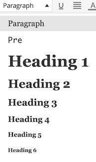
I do not think one should use h1 inside a post. That should be reserved for the post title only. Also, having all the six heading levels is too much. Three levels are enough for most uses. If you need more, you probably should divide the post into two or more separate articles to make it more readable.
Pre is useful if you paste code, but that is not for most people. Removed.
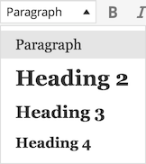
Here’s the simplified dropdown:
Alignment buttons
Alignment buttons can be used for two things. You can align text and you can align images. Alignment of text does not make much sense. Unless you write poetry maybe. Most users do not.
Alignment of images can be done by clicking an image in question and then clicking the proper alignment button from the popup menu.
Strikethrough and horizontal line
To simplify the default row a bit more, we could move the strikethrough and horizontal line buttons to the second row. Those buttons can be useful, but not most of the time.
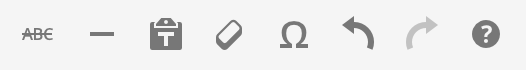
Secondary row modifications
I would like to remove the underline button, since one should not write underlined text on the web in general. An underline denotes a link.
One should not use full justified text on the web, unless it can be automatically hyphenated. Until browsers do that, I would remove the button.
Text color choices should not be done by the author. Instead, a style selection tool could be used (that can be activated through the TinyMCE API, if needed for the content and the design of the site).
Indent and outdent buttons do not make sense to me. What is their use case? Remove them, I say.
Here is the end result for the secondary row:
It’s actually so small number of buttons that it almost makes sense to put all the buttons to the same row.
Conclusion
It is easy to revamp the editor toolbar to be move usable, simple and useful.
It will require a way more thorough analysis to make the changes on the product level, but at least for our clients a setup similar to what I have described above makes a lot more sense than the current default.