Redefining web design

I’ve been a big fan of Yiibu’s Rethinking the Mobile Web presentation and the whole approach for some time now. That is basically what I’ve been recommending my clients implement as their mobile strategy. You should really see the slides of the presentation, if you have not already.

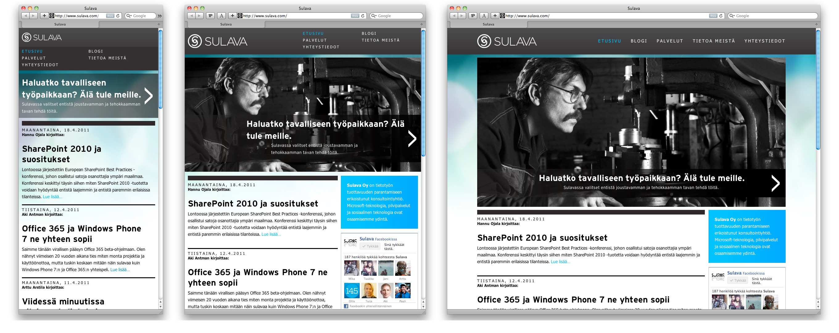
But as I’m not only a consultant and – more importantly – to practice what I preach, I’ve been doing something like this on my development projects. The first one is the blog and website of Sulava. (More about the implementation details in another post later.)

Sulava.com side adapts to window size from about 300 pixels to 1000 pixels

Actually working with this stuff made me convinced this is the future.

I asked Bryan Rieger of Yiiby if they had any brand name for their approach, because I felt it would make it much easier to communicate these ideas if we had a name for them.

@bryanrieger Bryan Rieger: @akibjorklund hmm, not one for brand names myself, but we've simply been referring to it as 'adaptive' via progressive enhancement. – 20 Feb via Twitterrific

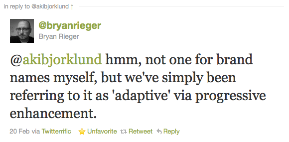
“Adaptive design via progressive enhancement” doesn’t quite roll of the tongue now, does it?

I was proposing “one web” – but found out later that term is already been suggested but had not catched on. Plus those words are too generic.

Last week Rieger was touching the same subject:

@bryanrieger Bryan Rieger: Honestly, what is wrong with 'web design'? We should have been designing 'adaptive' and 'responsive' web experiences all along... :/ – 24 Apr via web

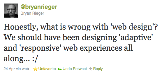
That’s a real good question. So instead of me proposing a new term (although it is tempting) I’m going with that – web design. It just needs to be redefined.

Here are some of the main characteristics of modern web design:

  1. Mobile first – Design and build websites first for the least capable device.
  2. Single adaptive, responsive website – We don’t need a different mobile website in most cases. It is just more work in the long run.
  3. Functional, usable design – Don’t just “make it pretty”. Make it beautiful by making it obvious and easy.
  4. Progressively enhanced – Using cutting edge technologies in a way that does not prevent older/inferior browsers to also work.
  5. Semantic markup – We cannot always know beforehand all the uses of our design. By making the markup as semantic as possible we maximize its reuse possibilities.
  6. Designed to fail – On an environment that is constantly chancing, failure is inevitable. By assuming everything can fail the design will be more future-proof. Part of design to fail is making sure the website is periodically evaluated for defects and improvement possibilities
  7. Performance-optimized – Performance optimization is not just for unreliable mobile connections – the society keeps moving faster (people actually walk faster). Websites need to load faster too.

This is not to say the list is complete or that every item on it is even mandatory. The list will never be complete, since the web is constantly evolving.

Web design is in a way in crisis. It has become a commodity. Many designers do not appreciate their own work enough and are getting away from the actual implementation to do more high-level stuff or sometimes getting out of the business entirely.

We need to be more enthusiastic of what we do. Our work has more meaning than the message it delivers. It is about the people the message serves. We cannot serve the people well by detaching ourselves from the actual output of our work.

We also need more challenges. Mindlessly converting PSD files into CSS layouts or acting as an email-controlled Photoshop is not what I call web design. There are after all many outsourcing services that can do that kind of work for us.

By making our work meaningful we make sure we and others appreciate our work in the future too. Luckily web design has gotten a lot of new toys lately to play with from the browsers manufacturers. And not only toys but actual stuff we can use.

But still, web design is not about pretty pixels or latest tricks in CSS. It is about a craft. A great craftsman will always find ways to be more knowledgeable and mindful about what he or she does.

Web needs to keep moving forward and I for one would like to be part of the movement.

Notes on using HTML5 input type=search and the placeholder attribute

<input type=search> is one of the HTML5 additions to form input types. In theory you can just replace the old <input type=text> with the new type and browsers continue to work and the site is now more semantic. In practice working with type=search is not that simple.

First thing you probably want to do is to remove Webkit’s default, heavy styling. You do that by these CSS commands:

-webkit-appearance:textfield; -webkit-box-sizing:content-box;

I initially used the former, but after some odd width calculation issues I found out that latter is also needed to actually fully restore familiar type=text behavior.

Placeholder text is another wonderful addition to input elements (not just type=search). This replicates the common behavior of having the search field label within the field itself (until the user focuses the field). You add placeholder text by adding an attribute to the input element like this: placeholder=”search this site”.

To gracefully degrade, use Modernizr to detect a browsers with no support:

jQuery(function($) {
	if (!Modernizr.input.placeholder || navigator.userAgent.match(/opera/i)) {
		$('input[placeholder]').hint();
	}
});

Here I decided to replace native placeholder support on Opera, since there are no styling options for it, yet. The text is always in #7f7f7f, which was not an option, since the background was exactly that color.

To style placeholder text you need these rules:

input[type=search].blur{color:#ddd}
input[type=search]::-webkit-input-placeholder{color:#ddd}
input[type=search]:-moz-placeholder{color:#ddd}

You cannot combine those selectors, since the rule will stop working as expected. .blur is for browsers that do not support native placeholder behavior.

And here is the modified version of the plugin that adds placeholder behavior. To make it more HTML5 friendly, I basically just replaced the use of title attribute with placeholder attribute.

/**
* @author Remy Sharp
* @url http://remysharp.com/2007/01/25/jquery-tutorial-text-box-hints/
* Modified to use placeholder attribute by Aki Björklund, https://akibjorklund.com/
*/
(function ($) {
	$.fn.hint = function (blurClass) {
		if (!blurClass) { 
			blurClass = 'blur';
		}

		return this.each(function () {
			// get jQuery version of 'this'
			var $input = $(this),

			// capture the rest of the variable to allow for reuse
			placeholder = $input.attr('placeholder'),
			$form = $(this.form),
			$win = $(window);

			function remove() {
				if ($input.val() === placeholder && $input.hasClass(blurClass)) {
					$input.val('').removeClass(blurClass);
				}
			}

			// only apply logic if the element has the attribute
			if (placeholder) { 
				// on blur, set value to placeholder attr if text is blank
				$input.blur(function () {
					if (this.value === '') {
						$input.val(placeholder).addClass(blurClass);
					}
				}).focus(remove).blur(); // now change all inputs to placeholder

				// clear the pre-defined text when form is submitted
				$form.submit(remove);
				$win.unload(remove); // handles Firefox's autocomplete
			}
		});
	};
})(jQuery);

W3C brändäsi HTML5:n, puristit itkivät

HTML5HTML5:stä oli muodostunut kansan suussa jotain muuta kuin mitä tiukkaan luettuna HTML5-speksi käsittää. Puristien mielipiteillä ei ole väliä. W3C teki oikein tarttuessaan tilaisuuteen vahvistaa tuota brändiä, joka joka tapauksessa oli jo olemassa. Kun haluaa korostaa eroa, ei ole kovin vaikeaa puhua HTML5-speksistä silloin kun sitä tarkoittaa ja jatkaa puhumista web-teknologioiden toisesta tulemisesta HTML5:na.

Tämän hullun applikaatiohypen aikana maailma tarvitsee yksinäisiä sankareita, jotka pelastavat meidät kaikki pahoilta megakorporaatioilta.