Make your call to action call some action

Don’t put your call to action on an image when emailing your customers. Most people won’t see it. If an action is required, mention it in the subject – or at least in the first paragraph. (This applies to not only mass email but also to private messaging.) The case in point:
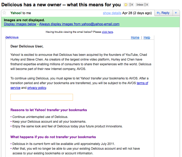
This important email does not look so important when images are not downloaded. The subject line or the first paragraph mention no action required.

Look at it again, this time with images displayed:
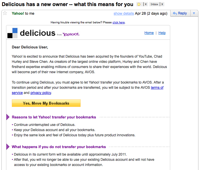
Now it is pretty clear I need to do something. Too bad by default most people will not see the button.

It is quite telling that I had already deleted this email but happened to see on Twitter someone mentioning something about agreeing to something related to Delicious. So I went back and noticed this.

Always test your email in most popular clients. Don’t focus on visual perfection – as it is impossible today – but usability.

The Cube’s Fatal Flaw: Cats

As a cat owner I found this amusing. Apparently cats are one of the reasons why the Apple’s G4 Cube failed:

Worse, the top of the machine was a magnet for dirt, hair and cats. Hair would fall across the optical drive slot and then get sucked right into the drive when you inserted a disc.

And, yes, cats. My friend had a cube at his home. The cats would love to sit on top of the nice, warm, flat cube. Which would both fill it with cat hair and turn it off… then on… then off… then on… then off for as long as the cuts stuck around. He finally had to put one of those pigeon guard kind of strip of nail things on top of the cube to keep the cats from corrupting his filesystem!

bbum’s weblog-o-mat: The Cube’s Fatal Flaw (via)